

For many years now I’ve appreciated the US Debt Clock website. It’s both educational and kind of terrifying.
I wanted something that goes beyond debt and financial indicators though, so I built my own. I call it The Collapse Index.
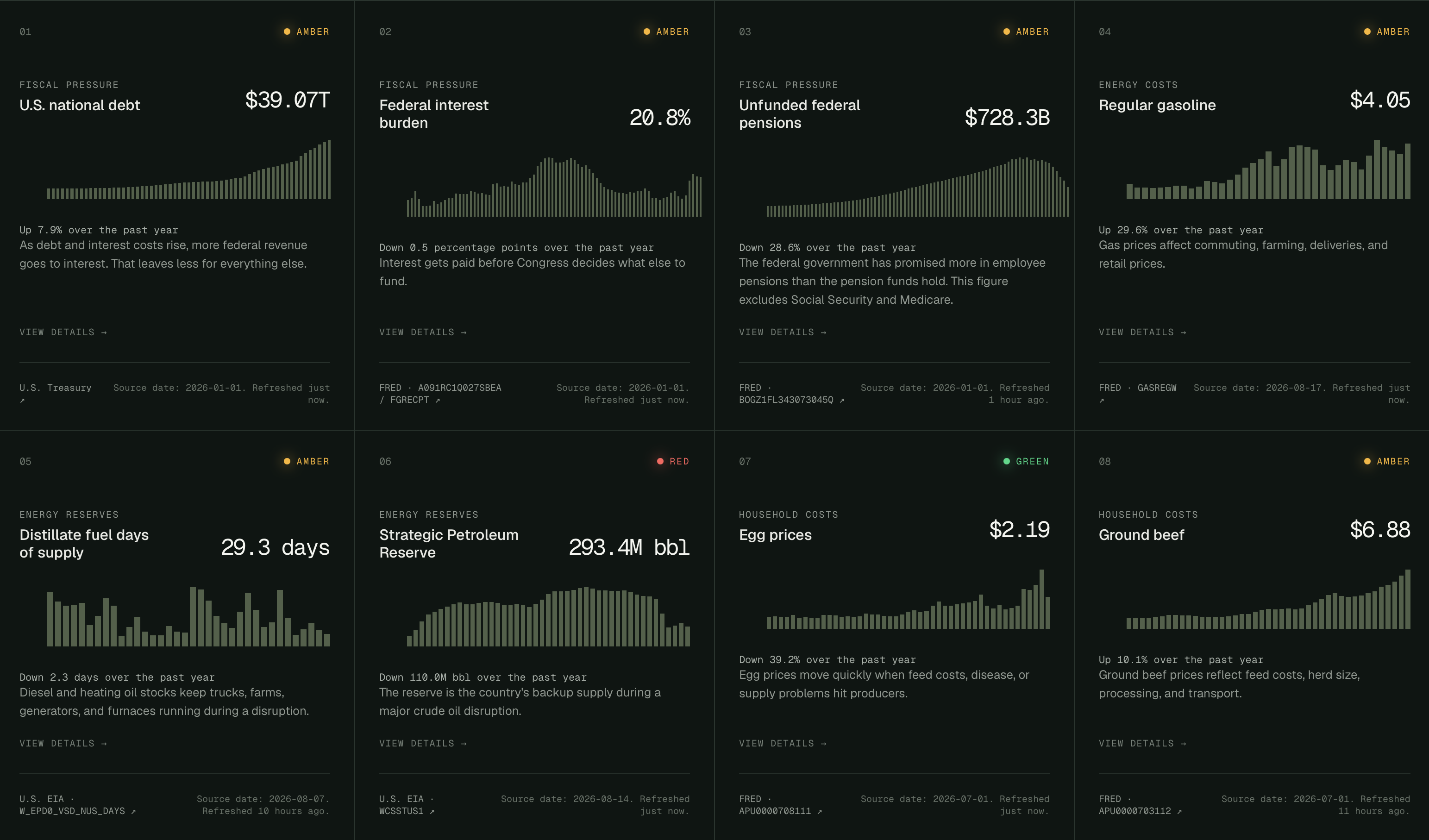
The dashboard tracks 38 indicators, pulling live data from over a dozen sources. The data is all presented in a single dashboard, and each indicators has its own chart. Click into any one of them for more details.
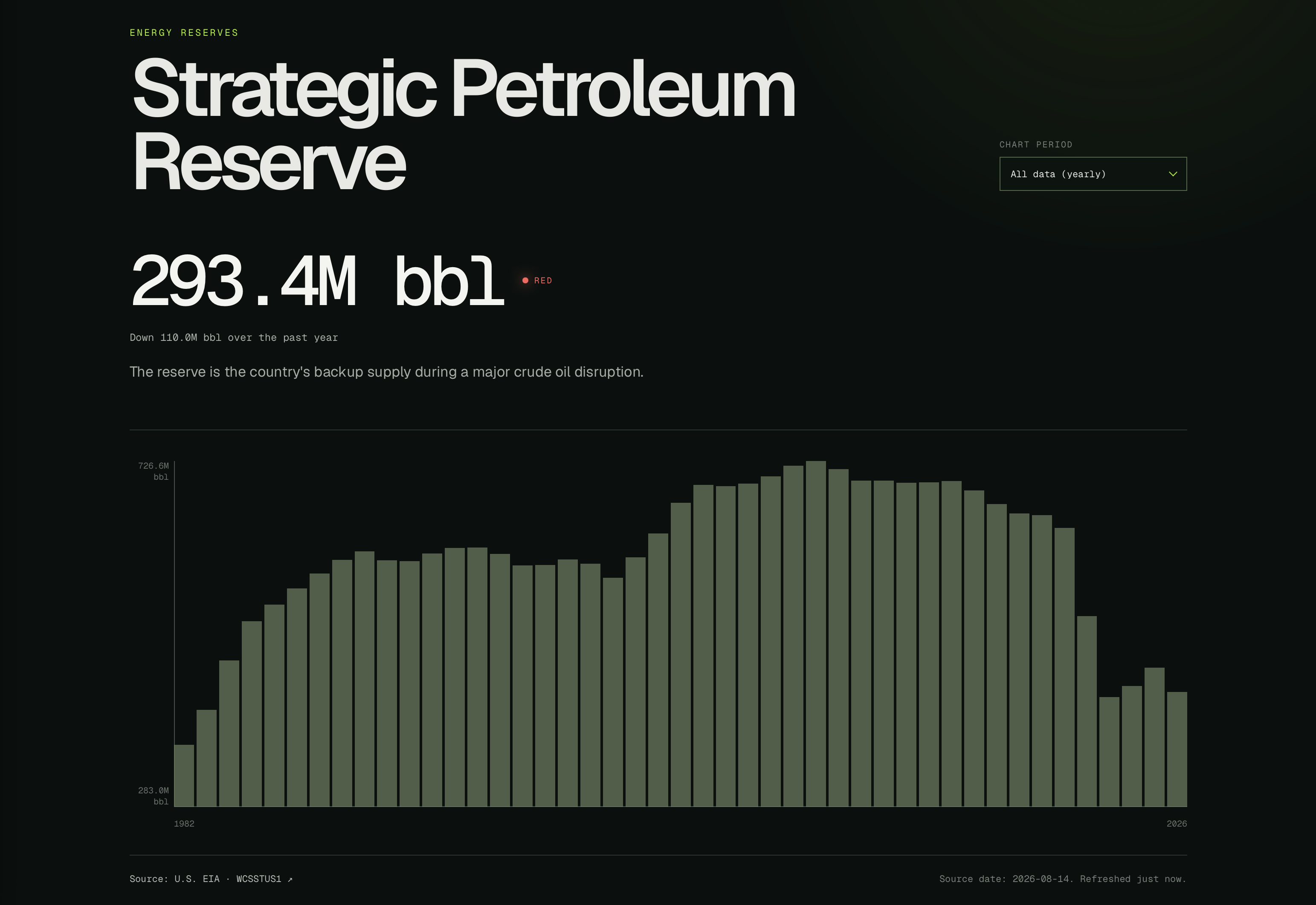
Here’s the data on the strategic petroleum reserve, going back to 1982. You can see we’re at a low we haven’t been at in over 43 years.
But there’s more than just economic indicators here. The index also tracks how much of the U.S. is in severe drought, PFAS in drinking water, sperm counts, port container dwell time, confidence in institutions, grid outage in minutes, and much more.
All the indicators are summed up together, weighted, and you get an overall score, which right now sits at 4.9 out of 10. If it goes up, we’re edging closer to collapse. Lower is better. Right now we’re kind of in the middle.
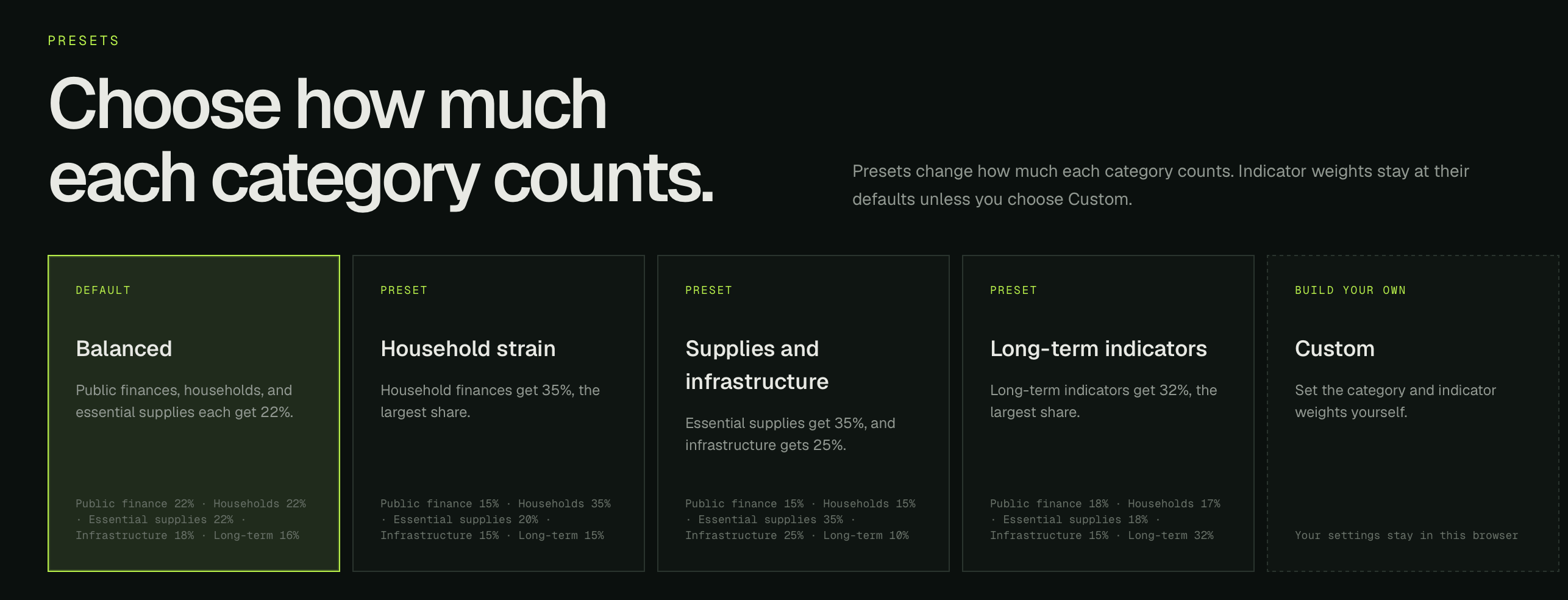
You can also decide what should matter most for yourself. Open the methodology page and pick a weighted preset, or adjust every slider yourself.
The site is completely free. Explore The Collapse Index.
If you find it useful, send it to someone who might want a clearer picture of where things stand.
Want to support my work? Becoming a supporter unlocks more features on Lookout Map and helps fund free projects like The Collapse Index.